

Topcoat
Majestic Pure Color
Our Most Beautiful Paint


CURATED COLOURS FROM SOULFUL SPACES
03 Aug 2026
5 min read
The festive season is about colour, but more than that, it's about the spaces we come together in. A home that feels warm and beautiful sets the tone for everything that happens inside it, the meals, the laughter, the quiet moments between.
Colour plays a bigger role in that than most people realise. The right colour can shift a room from restless to calm, from ordinary to genuinely inviting. Here, Natrah, Jotun Southeast Asia's Colour Manager, shares her festive interior colour inspiration from Soulful Spaces, Jotun's 2026 Global Colour Collection, for homes that feel as good as they look.
The cool teal that brings the room together.

This is Natrah's go-to festive colour, and it's easy to understand why. Shared spaces carry a lot during the festive season, and Iconic absorbs all of that energy without losing its elegance.
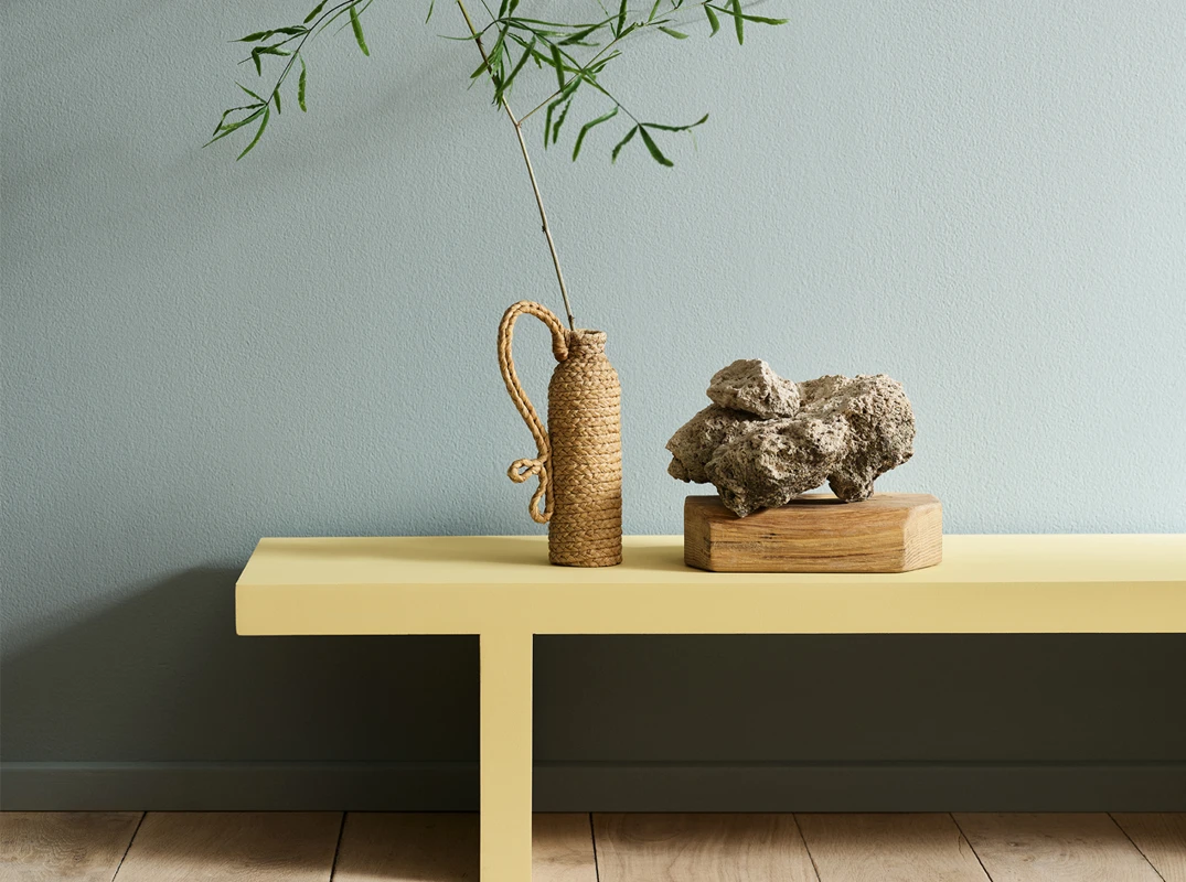
It's one of the most versatile living room colours for the festive season, warm enough to feel welcoming, considered enough to feel special. Beautiful on its own, and equally beautiful when paired with fresh yellows or golden pink tones for a festive palette that feels uplifting without ever feeling excessive.
Tip: Pair Jotun 6378 Iconic with Jotun 1965 Ginger Tea for a fresh, festive combination that balances cool and warm beautifully. Add golden pink accents to bring the palette to life.
A retreat from the festivities.
As a calming bedroom wall colour, Jotun 6379 Cityscape creates the kind of retreat that becomes essential when the festivities are in full swing elsewhere. One of the most considered calming colours for bedrooms this season. A space to breathe, rest and return to the table feeling restored.
Tip: The muted character of Jotun 6379 Cityscape works beautifully with blue and green tones, as well as soft pinks, peaches and yellows, while refreshing whites, beiges and greys.
Warmth without the overwhelm.

Every festive home needs a little sunshine. Jotun 1965 Ginger Tea is a warm yellow interior paint, soft and sunny rather than sharp or bold, the kind of colour that makes a room feel instinctively inviting the moment you walk in.
It's one of those warm festive home colours that works equally well for family gatherings at home and quieter evenings in. On its own it's cheerful and grounding. Paired with bluish greens like Jotun 6378 Iconic or Jotun 6379 Cityscape, or alongside golden white tones, it forms a festive palette that feels relaxed, layered and full of life.
Tip: Natrah recommends pairing Jotun 1965 Ginger Tea with bluish greens or golden whites for a palette that feels warm and festive without being loud. A little sunshine goes a long way.
When your home is at the centre of the celebration, every detail counts, including the finish.
All three colours are part of Soulful Spaces, Jotun's 2026 Global Colour Collection, and are available in Majestic Pure Color, our super matt interior paint with a zero-reflection, anti-reflective finish that remains completely undisturbed by light. No shimmer, no shifting. What you see on the colour card is exactly what you'll live with on the wall.
Explore all 24 colours in Jotun's 2026 Global Colour Collection and find inspiration across three colour palettes.

Watch our regional colour manager, Natrah Omar, as she shares her curated colour palette for the festive season.
Discover how the right colours can bring warmth, personality and a festive spirit into every space.

Jotun's Colour Team
Southeast Asia Colour Experts
Presented by Jotun Southeast Asia's team of colour experts, creating inspiring colour stories shaped by culture, design and the way people live.
Find the nearest Jotun dealer, with the Jotun Interior Colour Centre available at most retail outlets.


