


เคลือบด้านนอกสุด
มาเจสติก เพียว คัลเลอร์
สีที่สวยที่สุดของเรา


CURATED COLOURS FROM SOULFUL SPACES
06 Oct 2026
5 min read
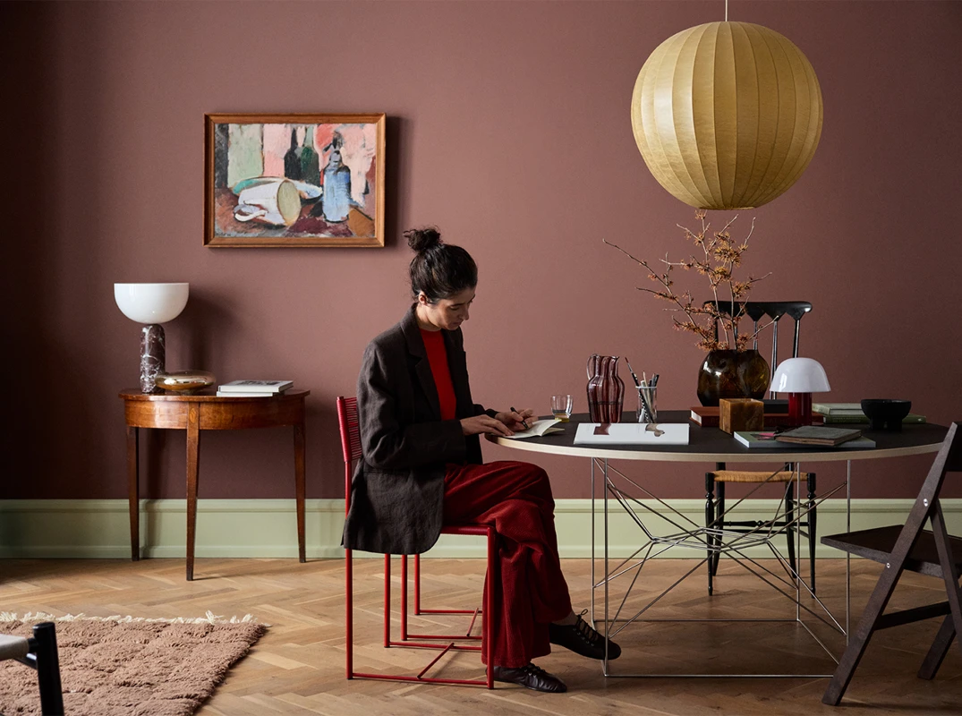
Colour is rarely just one thing. The same red that feels bold and dramatic in one room can feel like a warm cocoon in another, depending on what surrounds it, how it's lit, and what it's paired with.
JOTUN 2951 Sophisticated Red is a deep, elegant burgundy red with warm undertones. It is the hero colour of Soulful Spaces, Jotun's 2026 Global Colour Collection, and it is more versatile than its depth might suggest. Here, Natrah, Jotun Southeast Asia's Colour Manager, shows three ways to bring it into your home, each one a different mood, each one a different way of seeing the same beautiful colour.
JOTUN 2951 Sophisticated Red + JOTUN 12313 Soft Dunes
JOTUN 12313 Soft Dunes is a warm, sandy neutral with a gentle golden undertone. Paired with Sophisticated Red, it does something quietly remarkable: it softens the depth of the red without diminishing it, creating a palette that feels both classic and modern at the same time.
This is a deep red wall colour at its most liveable. Grounded and refined, with a sense of balance that makes it easy to spend time in. Natrah recommends this combination for a cosy corner, a reading space or a home library, anywhere you want the room to feel considered and enveloping rather than intense.
If you have been drawn to red but unsure where to begin, this is the place.
JOTUN 2951 Sophisticated Red + JOTUN 8493 Green Tea
JOTUN 8493 Green Tea is a muted golden green that brings an immediate sense of freshness into a space. Alongside Sophisticated Red, it creates one of the most compelling red colour combinations for interiors: the green lifts the richness of the red, and the red deepens the vitality of the green.
The result is lively without being loud. A bold but warm interior colour pairing that feels intentional and full of energy, ideal for dining areas, social spaces or any room that benefits from a little life and brightness. This combination shows that red can feel exciting rather than heavy, vibrant rather than overwhelming.
JOTUN 2951 Sophisticated Red + JOTUN 20362 Pink Ambience + JOTUN 1974 Golden Walnut
This is the most layered of the three moods, and the most rewarding. JOTUN 20362 Pink Ambience is a muted golden pink that brings warmth and softness to the palette. JOTUN 1974 Golden Walnut adds earthy contrast and depth. Together with Sophisticated Red, the three colours form an elegant red living room colour palette that feels genuinely luxurious.

Pink Ambience keeps the red from feeling heavy. Golden Walnut grounds the whole combination with texture and warmth. The result is a space that feels richly layered, design-led and deeply considered. For homes that are ready to embrace colour with full confidence, this is the mood to explore.
JOTUN 2951 Sophisticated Red is not a single-mood colour. Calm or vibrant, restrained or expressive, it adapts beautifully to what it is paired with. That versatility is what makes it the hero of Soulful Spaces, Jotun's 2026 Global Colour Collection.
Ready to explore? Browse all 24 colours at jotun.com.
Explore all 24 colours in Jotun's 2026 Global Colour Collection and find inspiration across three colour palettes.

Sophisticated Red reveals a different side of its personality with every pairing.
Watch our Regional Colour Manager, Natrah Omar, as she shares three curated palettes and the moods they bring to life.

ทีมผู้เชี่ยวชาญด้านสีของโจตัน
ผู้เชี่ยวชาญด้านสีประจำภูมิภาคเอเชียตะวันออกเฉียงใต้
เนื้อหานี้จัดทำโดยทีมผู้เชี่ยวชาญด้านสีประจำภูมิภาคเอเชียตะวันออกเฉียงใต้ของโจตัน ผู้สร้างสรรค์แรงบันดาลใจด้านสีสันผ่านมุมมองด้านวัฒนธรรม การออกแบบ และวิถีชีวิตของผู้คน เพื่อช่วยให้ทุกคนค้นพบโทนสีที่เหมาะกับการใช้ชีวิตในแบบของตนเอง
ค้นหาร้านตัวแทนจำหน่ายชั้นนำของโจตันที่ใกล้คุณที่สุด โดยคุณสามารถพบ Jotun Interior Colour Centre ได้ในร้านตัวแทนจำหน่ายชั้นนำส่วนใหญ่


