
Nuances collection 2025
Jotun's new colour collection for the 2025 season, Nuances, celebrates the impact of subtle shades.

Tại Jotun, chúng tôi đã tạo ra các loại sơn với nhiều màu sắc trong gần 60 năm. Bộ sưu tập màu sơn trải dài với hàng nghìn loại màu, mỗi màu đều có một câu chuyện riêng. Những năm trước, bảng màu thường niên của chúng tôi đã mang đến những tông màu và sắc màu mới mẻ cho ngôi nhà. Nhưng năm nay, chúng tôi sẽ tái khám phá.
Một vài màu ở trang này là màu mới Tuy nhiên, nhiều màu sắc khác đã được lựa chọn cẩn thận từ kho lưu trữ của chúng tôi - những màu sắc trường tồn đầy cảm hứng, có thể được sử dụng để kể về những câu chuyện mới trong ngôi nhà. Chúng tôi đã nhóm các màu này thành bốn nhóm - bốn câu chuyện, tuy nhiên, bạn vẫn có thể kết hợp màu mà mình thích. Ngôi nhà cũng giống như cuộc sống, là thứ chúng ta tạo ra. Một ngôi nhà được thiết kế tỉ mỉ sẽ luôn hợp thời với bất kể màu sắc nào.

Khám phá xu hướng màu sắc năm 2021 qua bốn chủ đề độc đáo. Từ những màu đất ấm áp đến những gam màu tối giản, mỗi chủ đề đều mang một câu chuyện riêng. Khám phá cả bốn chủ đề và tìm ra những màu sắc ấn tượng nhất.
12118
hummusA pale, warm yellow tone. This is a pale yellow tone that comes across as warm and accommodating. It is muted, lovely and elegant.
1392
antique yellowA warm yellow tone. This is a warm yellow tone that is accommodating and lovely.
10428
masalaA strong, clear ochre-yellow tone. This is a colour that immediately makes you think of fragrant spices and food from southerly regions.
12120
desert pinkA golden pink tone. This colour can also be described as a peach tone, as it has clear golden undertones in the pink.
12124
natural clayA burnt orange tone. This is a muted but cheery orange tone.
20167
welcoming redA golden red tone. This is a gentle, pleasant red tone with a hint of pink.
12127
earthy brownA dark, golden brown tone. This is a brown tone with obvious yellow undertones.
0486
early rainWhite, a colour of purity, suggests goodness and innocence. Its elusive nature provides a sense of serenity and the essence of perfection.
1276
softA muted, golden beige tone. This is a good beige tone that works really well as a base colour.
1563
lucerneA muted beige tone. This colour is a muted beige tone with a golden undertone. This is not as warm and rounded as traditional beige tones, but it looks slightly more greyish.
1288
grand shadowA muted, greenish beige tone. This is a colour that will come across as a mix of beige, yellow and green.
10385
belgian brownA muted, golden brown tone. This is a fairly dark, greyish brown tone that comes across as warm and lovely.
12125
impressionA golden brown tone. This is a golden brown tone with clear hints of brown. It's exciting when teamed with a range of colours.
1303
observeA yellow-beige tone. This is a yellowish beige tone that will come across as far more golden than traditional beige tones. It fits in somewhere between beige and yellow.
5504
coastal blueA muted blue tone. Pleasant, calm and slightly greenish in undertone.
5503
natural blueA muted, calm blue tone. A soothing blue medium tone, discreet and timeless. This is a paler version of blue tone 5504 Coastal Blue.
4894
ocean airA muted, paler blue tone. This medium tone has a lovely hint of grey, and it could be described as both calm and timeless. It will work well in bedrooms, living rooms and kitchens, as well as in children’s rooms.
10963
golden bronzeBrown is a warm and woody colour that grabs attention. It's an essential colour of nature that symbolizes ease and contentment.
8469
green leafGreen, a colour of life, represents freshness and security. While it creates a restful atmosphere, it also possesses the intense power of nature.
1973
objectiveGrey is perceived as long-lasting and classic. It's an ideal background colour, and yet still carries authority. Grey also works well with flashy or colourful décor.
1024
timelessWhite, a colour of purity, suggests goodness and innocence. Its elusive nature provides a sense of serenity and the essence of perfection.
12123
contemporary whiteA golden, whitish tone. This is a yellowish white tone, and compared with the well-known 1001 Egg White and 1453 Cotton Ball, it is obviously slightly darker and slightly more yellow.
6379
cityscapeA muted mint tone. This is a greyish, blue-green tone often known as mint.
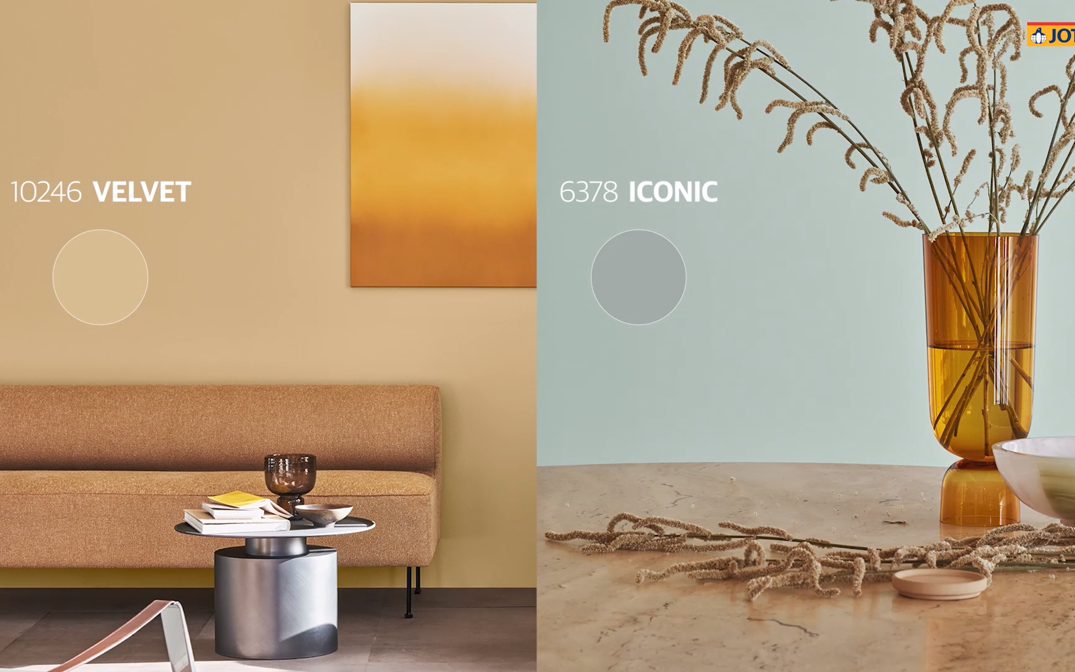
6378
iconicA muted mint tone. This is a greyish, blue-green tone often known as mint.
8118
crispA pale green tone. This is a pale, spring-like green tone with golden undertones. It is cool and easygoing.
12126
silhouetteA muted greyish-yellow tone. This exciting, grey-yellow tone can be described as a paler version of 11174 Curious Mind and 10961 Raw Canvas, albeing slightly less reddish in terms of its undertone.
10246
velvetA muted yellow tone. 10246 Velvet is a warm, muted yet clear yellow tone.
12119
vintage brownA muted brown tone. This is a warm, slightly greyish brown tone.
20162
mellowA red-brown tone. This is a mix of red and brown, but you could also call it a muted plum colour.
Sơn trang trí của Jotun được yêu thích ở nhiều quốc gia trên thế giới. Chọn khu vực trong danh sách dưới đây để xem liệu sơn của chúng tôi có được cung cấp ở quốc gia của bạn hay không.
Biến hóa ngôi nhà của bạn cùng những sắc màu trong bộ sưu tập năm 2021 của Jotun.

Jotun's new colour collection for the 2025 season, Nuances, celebrates the impact of subtle shades.

From our clothes to our homes, the colours that we surround ourselves with are a reflection of who we are and how we want to feel. In tribute to the art and science of colour, Jotun presents 23 colours for 2024.

Bộ sưu tập Câu chuyện 2023 là tuyển tập các màu sắc đậm tính biểu cảm, đầy hy vọng được thiết kế để truyền cảm hứng cho những thiết kế sáng tạo trong trang trí ngôi nhà tươi đẹp của chúng ta.

Bộ sưu tập Đoàn viên của Jotun là một loạt các màu sắc mới được phát triển được bổ sung bởi những sắc màu vượt thời gian. 28 sắc thái được thiết kế để pha trộn và kết hợp nhằm giúp thiết kế có cảm giác thoải mái, tràn đầy năng lượng và truyền cảm hứng.
Tất cả màu sắc của chúng tôi đều được pha trộn với công thức riêng biệt dành cho các sản phẩm của Jotun. Jotun chỉ đảm bảo kết quả màu chính xác khi sử dụng các sản phẩm và chất nhuộm màu của Jotun. Xin lưu ý rằng vật liệu nền, độ bóng, điều kiện ánh sáng và các bề mặt hoàn thiện khác có thể ảnh hưởng đến màu. Do sự khác biệt trong cài đặt màn hình và hệ điều hành, màu sắc xuất hiện trên màn hình của bạn có thể không phải là kết quả chính xác mà bạn mong muốn. Màu sắc hiển thị chỉ nhằm mục đích tham khảo.
A video is being shown
An image is being displayed
A brochure is being displayed