


Nuances collection 2025
Jotun's new colour collection for the 2025 season, Nuances, celebrates the impact of subtle shades.
 Global site

Jotuns Rediscover collection is a range of earthy and timeless hues to minimalistic shades that have been carefully picked from our archives.
Jotuns Rediscover collection is a range of earthy and timeless hues to minimalistic shades that have been carefully picked from our archives.
Jotun은 약 60년간 다양한 색상을 개발해 왔습니다. 당사의 라이브러리에는 수천 가지 색조가 있으며, 각각 고유한 스토리를 담고 있습니다. 과거에는 연간 색상표를 통해 홈 인테리어용으로 새로 개발한 톤과 색조를 공개했습니다. 그러나 올해에는 또 다른 발견을 진행하고자 합니다.
이 페이지에 표시된 일부 색상은 새로운 색상입니다. 하지만 많은 색상은 Jotun의 아카이브에서 엄선된 것으로, 집에 대한 새로운 이야기를 전달할 수 있는 변치 않는 영감을 선사하는 색채로 이루어져 있습니다. 이러한 색상을 4색의 스토리에 맞게 4가지 그룹으로 묶었으나, 반드시 따라야 하는 규칙은 아닙니다. 인생과 마찬가지로, 집도 우리가 만들어 나가는 것입니다. 그리고 어떤 색상을 선택하든 간에, 신중하게 고민한 집은 유행을 타지 않습니다.

네 가지 뚜렷한 테마를 통해 2021년도 컬러 트렌드를 알아보십시오. 흙빛 색조에서 미니멀한 색조에 이르기까지, 모든 테마는 저마다의 스토리를 담고 있습니다. 네 가지 테마를 모두 살펴보고 나를 가장 잘 표현할 수 있는 색상을 찾아보십시오.
12118
hummusA pale, warm yellow tone. This is a pale yellow tone that comes across as warm and accommodating. It is muted, lovely and elegant.
1392
antique yellowA warm yellow tone. This is a warm yellow tone that is accommodating and lovely.
10428
masalaA strong, clear ochre-yellow tone. This is a colour that immediately makes you think of fragrant spices and food from southerly regions.
12120
desert pinkA golden pink tone. This colour can also be described as a peach tone, as it has clear golden undertones in the pink.
12124
natural clayA burnt orange tone. This is a muted but cheery orange tone.
20167
welcoming redA golden red tone. This is a gentle, pleasant red tone with a hint of pink.
12127
earthy brownA dark, golden brown tone. This is a brown tone with obvious yellow undertones.
0486
early rainWhite, a colour of purity, suggests goodness and innocence. Its elusive nature provides a sense of serenity and the essence of perfection.
1276
softA muted, golden beige tone. This is a good beige tone that works really well as a base colour.
1563
lucerneA muted beige tone. This colour is a muted beige tone with a golden undertone. This is not as warm and rounded as traditional beige tones, but it looks slightly more greyish.
1288
grand shadowA muted, greenish beige tone. This is a colour that will come across as a mix of beige, yellow and green.
10385
belgian brownA muted, golden brown tone. This is a fairly dark, greyish brown tone that comes across as warm and lovely.
12125
impressionA golden brown tone. This is a golden brown tone with clear hints of brown. It's exciting when teamed with a range of colours.
1303
observeA yellow-beige tone. This is a yellowish beige tone that will come across as far more golden than traditional beige tones. It fits in somewhere between beige and yellow.
5504
coastal blueA muted blue tone. Pleasant, calm and slightly greenish in undertone.
5503
natural blueA muted, calm blue tone. A soothing blue medium tone, discreet and timeless. This is a paler version of blue tone 5504 Coastal Blue.
4894
ocean airA muted, paler blue tone. This medium tone has a lovely hint of grey, and it could be described as both calm and timeless. It will work well in bedrooms, living rooms and kitchens, as well as in children’s rooms.
10963
golden bronzeBrown is a warm and woody colour that grabs attention. It's an essential colour of nature that symbolizes ease and contentment.
8469
green leafGreen, a colour of life, represents freshness and security. While it creates a restful atmosphere, it also possesses the intense power of nature.
1973
objectiveGrey is perceived as long-lasting and classic. It's an ideal background colour, and yet still carries authority. Grey also works well with flashy or colourful décor.
1024
timelessWhite, a colour of purity, suggests goodness and innocence. Its elusive nature provides a sense of serenity and the essence of perfection.
12123
contemporary whiteA golden, whitish tone. This is a yellowish white tone, and compared with the well-known 1001 Egg White and 1453 Cotton Ball, it is obviously slightly darker and slightly more yellow.
6379
cityscapeA muted mint tone. This is a greyish, blue-green tone often known as mint.
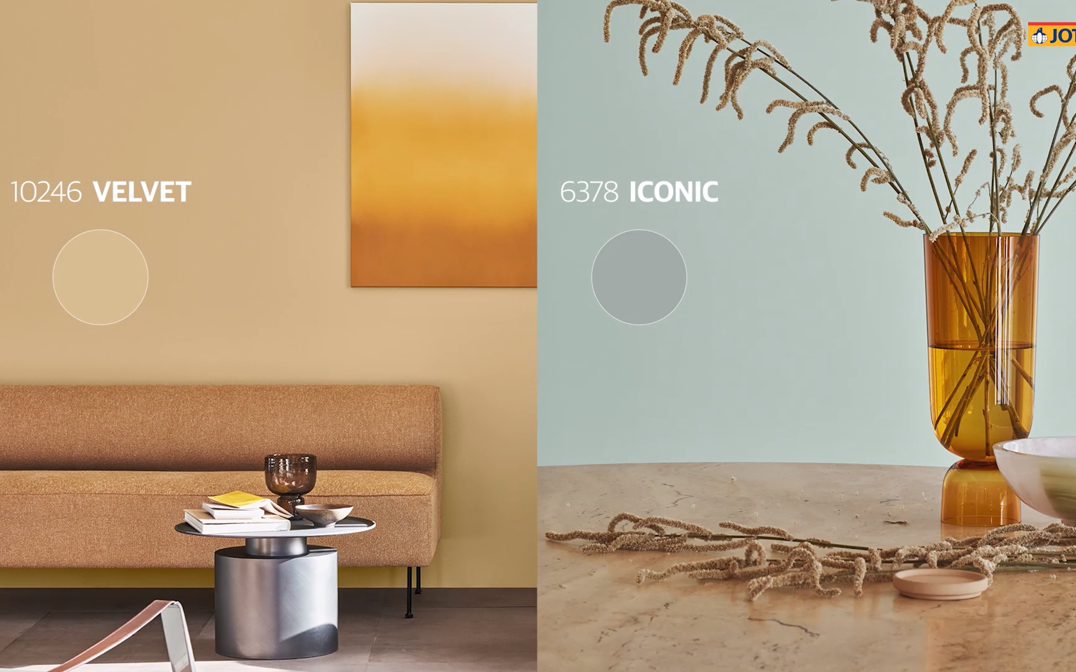
6378
iconicA muted mint tone. This is a greyish, blue-green tone often known as mint.
8118
crispA pale green tone. This is a pale, spring-like green tone with golden undertones. It is cool and easygoing.
12126
silhouetteA muted greyish-yellow tone. This exciting, grey-yellow tone can be described as a paler version of 11174 Curious Mind and 10961 Raw Canvas, albeing slightly less reddish in terms of its undertone.
10246
velvetA muted yellow tone. 10246 Velvet is a warm, muted yet clear yellow tone.
12119
vintage brownA muted brown tone. This is a warm, slightly greyish brown tone.
20162
mellowA red-brown tone. This is a mix of red and brown, but you could also call it a muted plum colour.
Jotun의 장식용 페인트는 전 세계의 많은 국가에서 사랑받고 있습니다. 귀하의 국가에서 Jotun 페인트가 제공되는지 확인하려면 아래의 목록에서 해당 지역을 선택하십시오.

Jotun의 2021년도 컬렉션의 색상으로 집을 새롭고 멋지게 단장해 보세요.
Jotun's new colour collection for the 2025 season, Nuances, celebrates the impact of subtle shades.

From our clothes to our homes, the colours that we surround ourselves with are a reflection of who we are and how we want to feel. In tribute to the art and science of colour, Jotun presents 23 colours for 2024.

스토리(Stories) 컬렉션 2023은 실내 장식의 독창적인 표현에 영감을 선사할 수 있도록 제조된 표현력이 풍부하고 희망에 찬 색상으로 구성되어 있습니다.

Jotun의 투게더(Together) 컬렉션은 유행을 타지 않는 색채를 보완하여 새로 개발된 다양한 색상으로 이루어져 있습니다. 28가지 색조를 믹스 앤 매치하여 휴식을 취하고, 에너지를 재충전하고, 영감을 얻는 인테리어를 연출할 수 있습니다.
당사의 모든 색상은 Jotun 제품을 위해 특수 제조된 고유한 제조법으로 개발됩니다. Jotun의 제품 및 안료를 사용한 경우에만 정확한 연색성이 보장됩니다. 기판, 광택, 조명 조건 및 기타 제품 마감은 색상의 외관에 영향을 줄 수 있습니다. 화면 설정 및 운영 체제의 차이로 화면에 표시되는 색상이 결과와 달라질 수 있습니다. 디지털 색상은 가이드로만 제공됩니다.
동영상 표시 중
이미지 표시 중
A brochure is being displayed